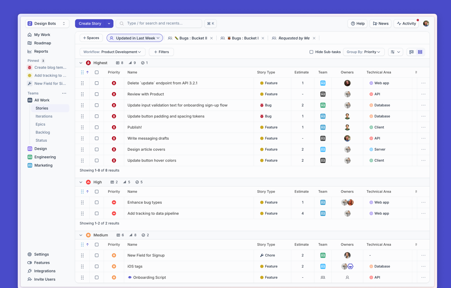
We made some pretty big improvements to the look and layout of Shortcut. If you haven’t seen it yet, log on in and take a look. Hopefully you like it! We think you will.
What did we change?
The most notable alteration is to the layout of our in app navigation. We’ve created logical groupings of features along the left hand navigation. There wasn’t necessarily any rhyme or reason behind the way we listed these items out in the past, but now we sort features into how they’re used.
Up in the top left are four that fall under what we call our Work category: Home — which was previously called Dashboard — as well as Stories, Epics, and Milestones.
Beneath these is our Planning category: right now this only includes Iterations, but will also include a feature we’re currently calling Timelines once it’s released from Beta.
And then there's More, which has a lot more. Here you'll find features that allow you to Categorize your work: Projectsand Labels.
As well as Analyze your work: Reports, Status, and Search.
You'll also notice that your Settings and Profile have been moved to the lower left where they are easier to see and therefore a bit easier to access. The navigation in the upper right hand of the page had been getting awfully crowded before and now everything accessed there slides out in a useful shelf, making Learn, Help, Recently Viewed, and Activity that much easier to use.
The left hand navigation also collapses to hide the labels, giving you more room to work.
Our layout and navigation aren’t the only things we changed.
Our Story Cards are cleaner, modern, and simplified, and we also now show the task counts right in the cards without you needing to open them up.
Why did we make these changes?
We all remember back in the day when Facebook used to change their layout roughly once a month, causing half the US population to melt down. We’re obviously not looking to recreate this experience.
But we also knew that we needed to make an update. Internally we felt like:
- Our UI could be visually overwhelming, especially when a customer first starts using Shortcut. There could be 10+ Items in the left nav.
- We threw a lot of concepts at users with no real sense of importance or hierarchy, with too much similarity between the elements. Clearly, our information architecture was getting a little out of control.
- We want to be able to build out the best navigational ux as we grow our product range and add new features.
- Initial engagement on new features was low because users overlooked them (hidden in the navigation) or didn't feel the need to go digging around to add them to their workflow. We want features to be easier to find and use as we add them, not harder.
It all came down to this:
How can we introduce new features and extend our product, while also making Shortcut simpler to use and easier to understand?
How’d we go about deciding what to change?
It started with research: what were users saying?
Onboarding and first impressions were generally overwhelming. “Where do I go first… what should I be looking at?”
Navigation customization was helpful since our own default nav wasn’t perfect, but it limited our own ability to grow and ensure our features are even noticed, and for some engineering leaders there was a real question of “Why do all my teams have a different navigation?”
The Story Cards were already solid, but needed some extra content (tasks), some restructuring, and styling improvements for better contrast and readability.
And visually, Shortcut was starting to look a little dated. These are the 2020s!
People are going places! The world is like the Jetsons! Uh, wait a sec...
Then we looked at the data: what were users doing?
We reviewed our key workflows, and the features that all you folks were using the most. Here’s some of what we found:
- Stories and Epics, as might be expected, were a very clear 1 and 2
- Iterations and Milestones were commonly moved up out of the old “drawer” that used to be in the left hand nav
- Reports, Search, and Labels were rarely moved up
- Only 17% of users even made a change to their side nav and only 3% of users made a negative change and moved an item down.
- Our header elements are where most of the work happens: creation, search, and the Activity Feed were big deals here.
Then what we’d do?
Even with this info in hand, we didn’t yet want to set in stone exactly what we’d change. So we dug into some design exercises and explored a ton of variations in search of the best possible approach. We went between designs that were just small tweaks vs others that would have had some notably big learning curves.
After all this we determined that we didn’t want to just go out and change everything. Instead, we took this as a chance to make the UX more streamlined as part of our longer term strategy of adding more useful features for customers to use over time.
We decided not to mess with any of the absolute essentials (like the Create button and search), and instead focus on the areas noted above where we felt like were not quite where needed to be.
Kick off!
As good Shortcut users we started planning our iterations, then finalized our designs and got to building. We released our changes internally for a few weeks to make sure everything was stable and then we started getting customers involved.
That process looked like this:
Early beta testing
We rolled things out to users who expressed interest in test driving it. We saw a great percentage of opt-in and stickiness early on.

We then surveyed users to see how they’d rate the initial changes. They rated them pretty highly.

A couple of big items popped up and they were an issue with our original new story colors and problems with background contrast.
We fixed that and continued to expand the number of users testing it and saw a continued increase in stickiness.

And then we A/B tested with newly signed up users, to ensure we saw better results with the new layout than with the old.
That brings us here! To the launch day.
The look and feel of Shortcut will always be a continual work in progress. We’ll be tweaking and making it better it until Shortcut is no longer a company, which the prophecies have said will not happen until January 17, 3522. So that’s a lot of years ahead of us to continue building an even better product.
Thanks to everyone who tried this out and gave us feedback. The usability of Shortcut is better because of you!
And if you’ve never used Shortcut before? Well, there’s no time like the present.
<!-- Code for CTA component starts here-->
<div class="post_body_cta"><div class="post_body_cta-heading">
Give us a whirl
</div><div class="post_body_cta-text">
Because you shouldn't have to project manage your project management.
</div><div class="common_buttons_wrap"><a href="/signup" class="button primary text-color-white w-button">Get Started - free forever</a>
<a href="https://api.app.shortcut.com/oauth/signup" class="button is-google w-button">Sign up with Google</a></div></div>
<!-- Code for CTA component ends here-->


%20(788%20x%20492%20px)%20(1).png)
.png)

