
We’ve been quietly rethinking how Shortcut looks and feels. How the product meets you every day, and how it supports the way modern teams actually work.
Today, we’re introducing the new Shortcut look: a calmer, clearer, faster, and more focused experience built to help teams stay focused on what matters.
This redesign isn’t just about looks. It’s about making Shortcut simpler in everything you do; from planning your next sprint to getting your next story done.
Change Has a Way of Growing
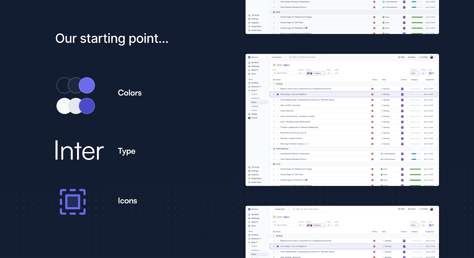
In early 2025, we launched a rebrand of Shortcut with new colors, updated typography, and a refreshed tone for how we show up as a brand. That effort became the spark for something bigger — a complete rethinking of our product UI. Around the same time, we’d been hearing from customers that the app’s visual design was starting to feel dated, noisy, unclear.
We also knew what wasn’t working: the interface felt bloated, the hierarchy was inconsistent, and different parts of the app spoke slightly different visual languages.
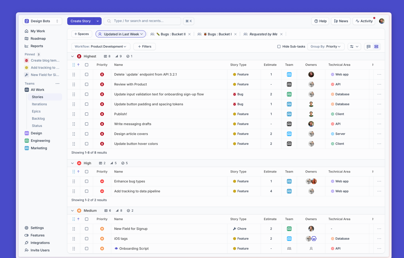
Color plays a big role in how teams plan and organize their work, so one of our main goals was to make it more functional, not just decorative. We wanted color and iconography to better support focus and clarity, while reducing visual noise and bloat. The goal was a calmer, more usable Shortcut that feels better to spend time in.
Designing, Learning, Adjusting
Instead of rebuilding everything behind closed doors and releasing it all at once, we chose to redesign Shortcut the same way we build new features — iteratively, transparently, and grounded in learning.
We began with a few loose visual studies, just simple explorations of color, typography, and spacing that helped us understand what direction felt right. There was no grand “new Shortcut” concept, just early ideas that set the tone. Once we aligned on a direction, we built an early prototype and started testing it internally.
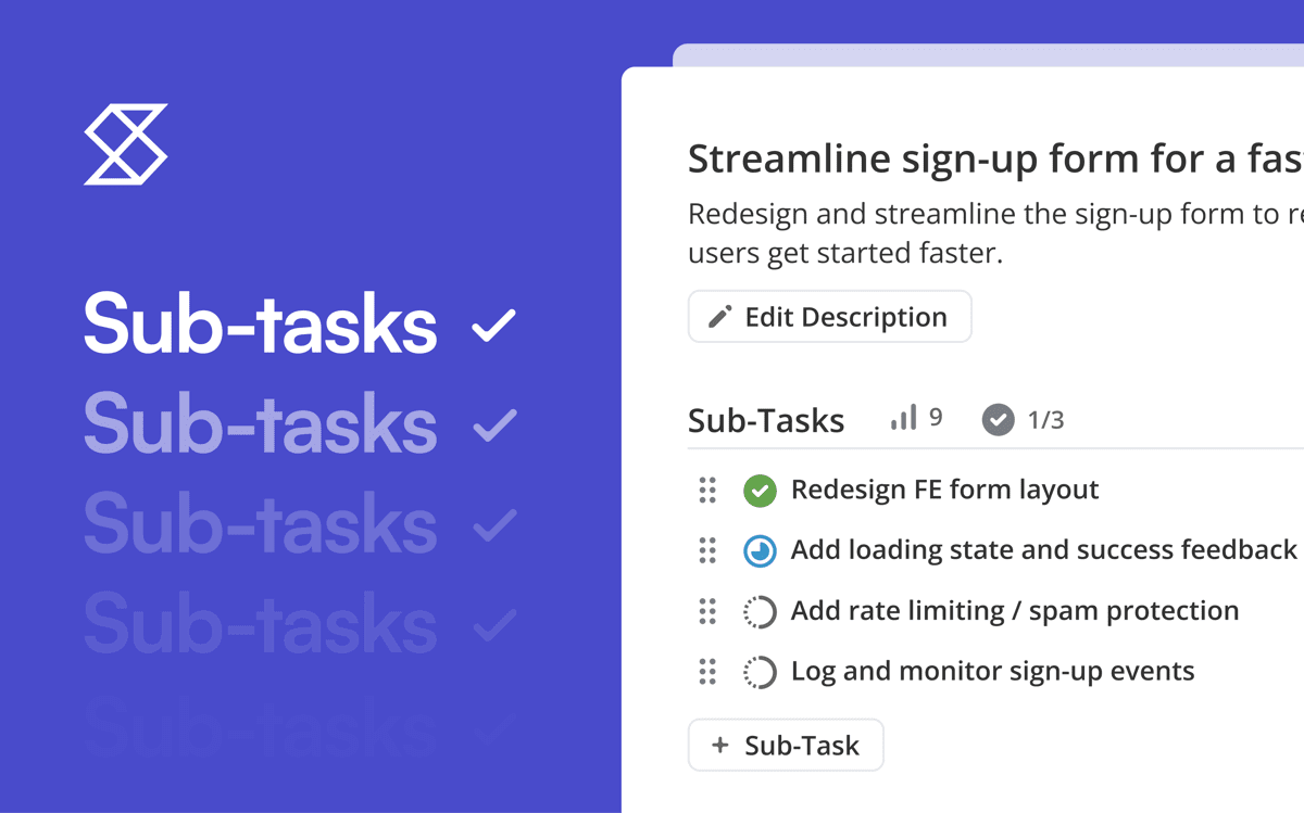
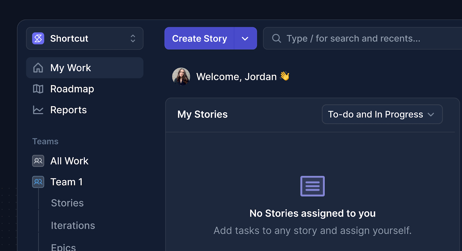
To keep things manageable, we divided the work into smaller pieces that could be built out, tested, and rolled out separately. The app header and navigation came first, followed by page layouts, and then feature-level updates like story creation, kanban boards, backlogs, and the roadmap.
This approach helped us move quickly without disrupting anyone’s workflow. It also gave us the flexibility to see how changes actually felt in daily use, not just in Figma.
We lived with the first internal updates for a while. Some things immediately felt great — the extra breathing room, the calmer colors. Others didn’t. We tweaked spacing, swapped icons, and adjusted navigation motion and transition speeds, the kinds of refinements that only become obvious once you use them every day. That feedback loop kept us honest and focused on how Shortcut feels to use, not just how it looks.
We weren’t chasing perfection; we were chasing steady progress. Each small release made the product feel more unified, and that sense of momentum mattered far more than any big reveal.
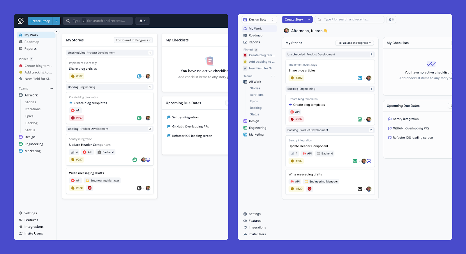
Our first real win came with the redesigned header and navigation, and the new colors and icons were in place. It was simpler, clearer, and just a little more lightweight. Once people felt that, the rest of the redesign stopped feeling risky. It felt natural.
What began as a tidy-up evolved into a foundation for the next phase of Shortcut’s look. It’s still the same tool, just calmer, sharper, and far more consistent.
Shaped by Those Who Use It
For the users who’d shared thoughts about the UI in the past, we reached out and invited them to try early versions and tell us what they thought. Their feedback shaped a lot of what came next, and we kept iterating, over and over.
Once we felt confident, we opened the second phase of the rollout, giving all customers the option to switch to the new Shortcut look. The response was encouraging: 77% of users opted in and stayed.
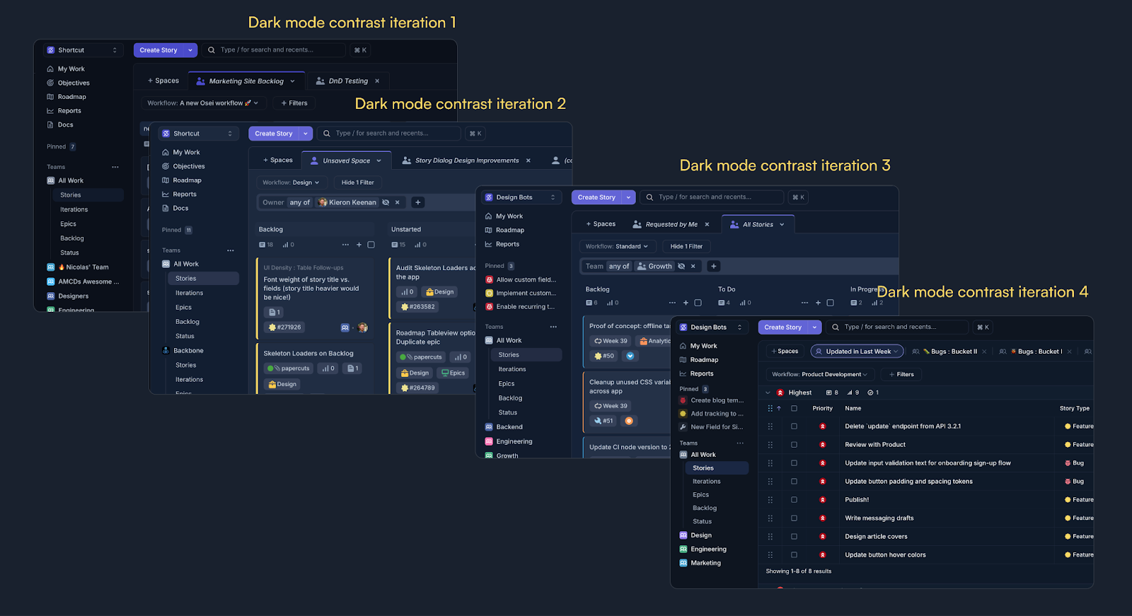
Color ended up being the most discussed part of the redesign, both inside and outside the team. Through surveys and conversations (with more than a hundred responses in total) we learned that dark mode contrast needed more refinement across different devices and environments. We quickly adjusted the palette, shipped updates, and more positive feedback from the changes.
Looking Ahead
We’re always listening to feedback from our community, and we’re committed to evolving Shortcut in ways that support you and your team even better.
We’ve also launched Korey, our new AI product management tool, which now integrates directly with Shortcut and other tools. You can assign Korey to help with your work, and the new UI gives us a stronger foundation to support shared experiences across both products.
That’s the backstory about the redesign and the process over the last few weeks. We’d love to hear what you think! You can share feedback right inside Shortcut or reach out on X at @shortcut.
The new Shortcut UI reflects how far we’ve come, and where we’re heading next.

%20(788%20x%20492%20px)%20(1).png)
.png)