Measure performance with these Shortcut Labs charts
Today we released a set of charts and reporting enhancements as part of Shortcut Labs that will help you measure performance and make better, data driven decisions.
What are these charts and enhancements?
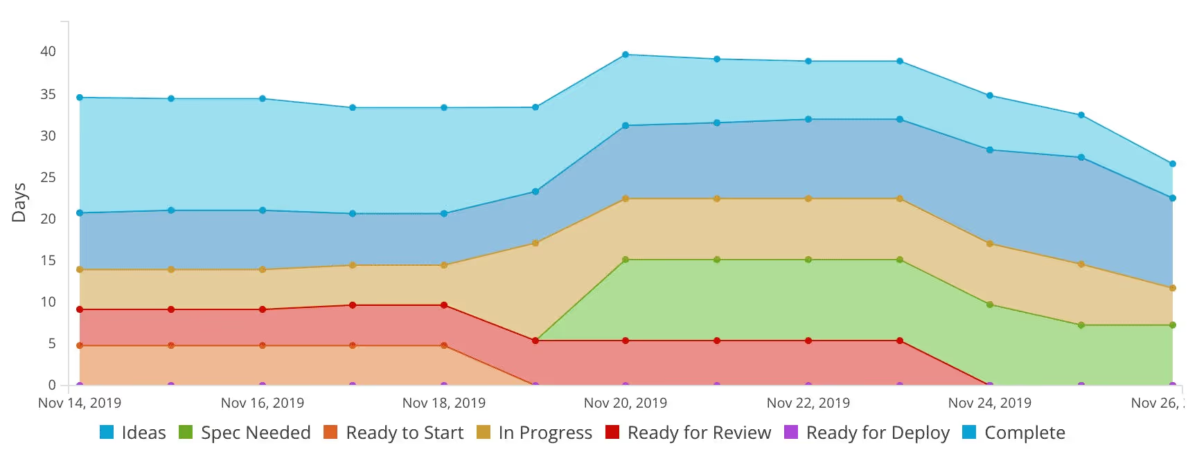
- Time Spent in Workflow State: A chart showing the amount of time your Stories spend in each workflow state.
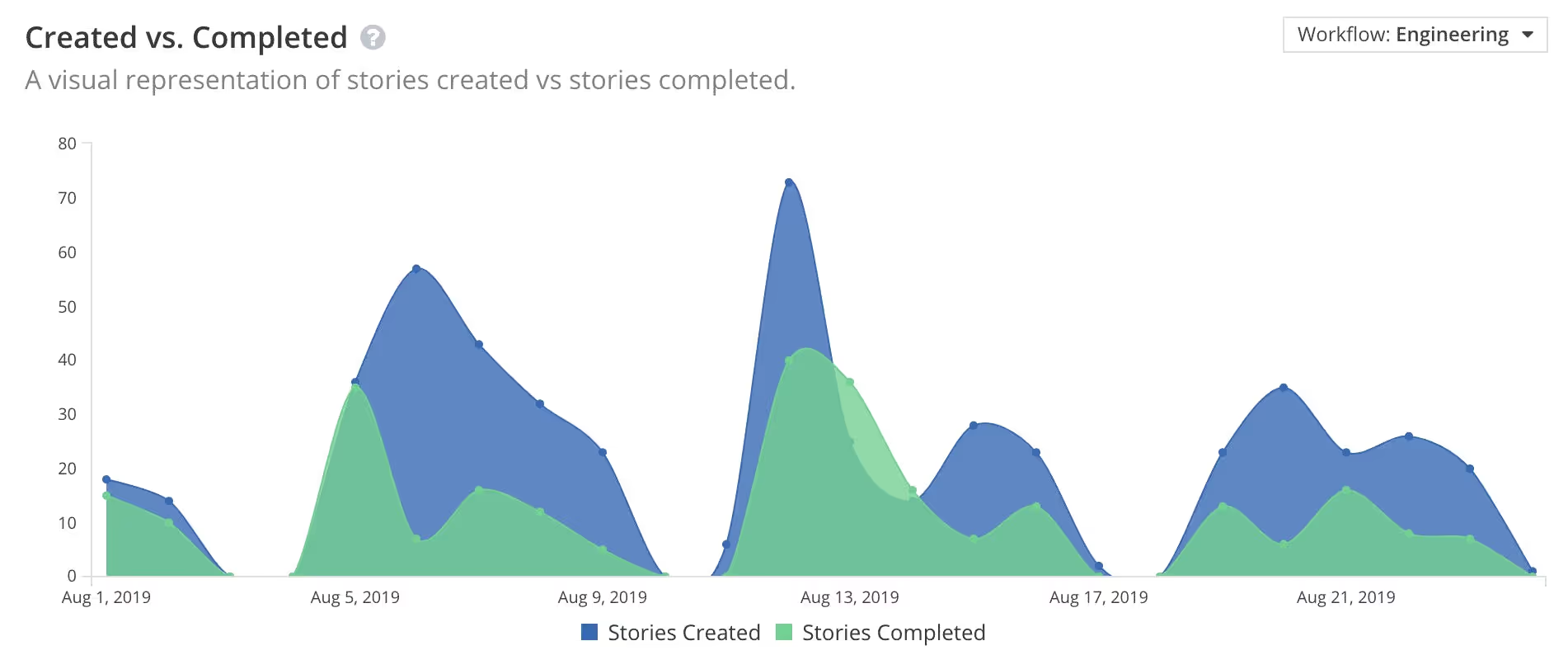
- Created vs Completed: A visual representation of the Stories you've created vs the Stories you've completed.
- Expanded reporting dates: You can now expand your reporting beyond our original 100 day limit. Now you can go all the way back the beginning of time or to January 2016, whichever is most recent.
You can activate these features in your Shortcut Labs settings. Shortcut Labs is available to organizations that are on a Standard Plan or higher. Watch this video (or skip it and just keep reading) to learn more about these new reporting features:
A quick tour of the new charts found in Labs
Uncover bottlenecks with the Time Spent in Workflow State Chart
Identify bottleneck patterns in your workflow over time. This can help empower your team to make changes to processes, capacity planning, and hiring, all backed by data instead of gut feeling.
How to read a Time Spent in Workflow State Chart
The Time Spent in Workflow State chart shows how long the completed Stories spent in each Workflow State before they reached completion. Since Workflow States are unique for each Workflow, only one Workflow can be viewed at a time, but you can easily switch between them. Note: You can also configure the calculation between Average, 25th percentile, Median, and 75th percentile.
- The x-axis (horizontal) represents date range; the intervals can be changed by using the Group By filter at the top of the page. When Grouped By Day, each day's data will represent the 7-day running calculation noted above, which means that all data from that date and 6 days prior will be included in the selected calculation.
- The y-axis (vertical) represents the number of days spent in each workflow state. The number used in this measurement will change depending on the calculation you select.
You can view this data in three visualizations: Stacked Area, Stacked Bar, or Line. The Stacked Area and Bar Charts are helpful for visualizing the total number of days spent in all Workflow States for a particular interval. The Line is useful for comparing time spent in the different Workflow States.

Ways to use Time Spent in Workflow data:
- Identify bottlenecks: If Stories are spending a lot of time in the "In Review" state this indicates the team may need to allocate more time to Peer Review or improve communication when review is needed.
- Request for headcount: If Stories are spending a lot of time in a particular workflow state - we'll use QA as an example - it likely means the team's volume is outpacing the QA team's capacity. Additional people may be needed.
- Recommend changes to process: If Stories are spending little to no time in any particular state it indicates that the state is often being skipped. Could be that the state is unnecessary or that its importance needs to be highlighted to the team to ensure it's put to use.
Track the pace of work Created vs Completed
See the ratio of Stories being created to Stories being completed at any given time. Determine if incoming work is keeping pace with completed work (or vice-versa). The most common use case for this chart is tracking bugs.
How to read the Created vs Completed Chart
As the name implies, this chart shows work that created and work that was completed within a period of time. Work in this case is represented by either points or Story count.
- The x-axis (horizontal) represents the date range; the intervals can be changed by using the Group By filter at the top of the page.
- The y-axis (vertical) represents the number of points or Stories, which can be configured via a dropdown to the right of the chart.
Stories and points are included in the "Created" counts on the day that the Story is created. Stories and points are included in the "Completed" counts on the day that the story moves to a "Completed" workflow state, whatever that state happens to be called within a given workflow.
Ways to use the Create vs Completed Chart data
- Track Bugs: Look at Stories created and completed by a certain story type. You can filter to view data just for just your team or by Story Type, Epic, Milestone or Project.
- Visualize the pacing of work: See changes in the ratio of created vs completed, in particular when the divide grows further apart, comes together, or switches the balance.
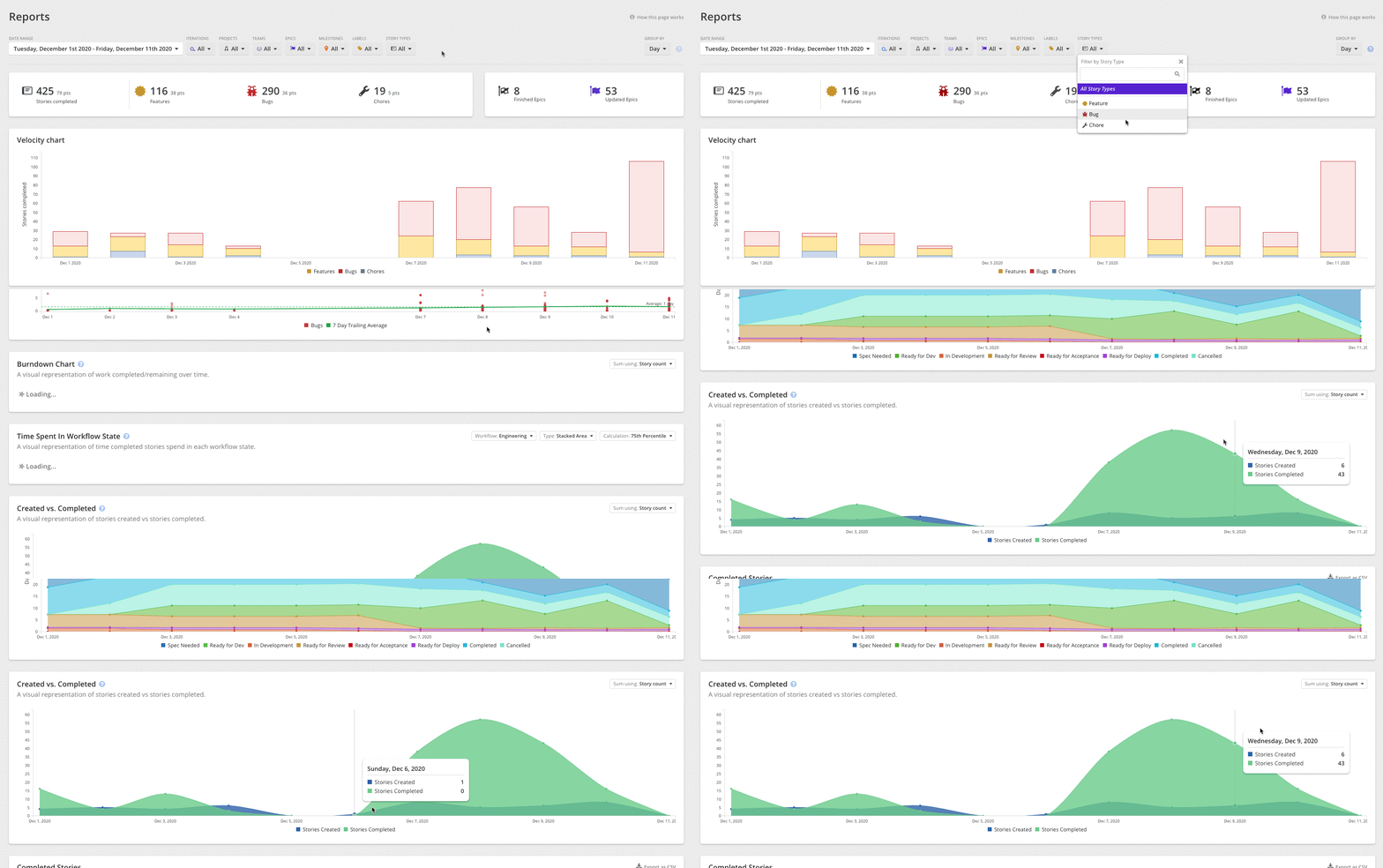
Expanded report date ranges so you can do more with your data
Now you can pull reports for date ranges that go beyond 100 days. Go all the way back to the Big Bang or to January of 2016, whichever comes first when traveling backwards in time (note this means that, unless you happen to have direct access to a wormhole, you will not be able to see what your org's Story Created vs Completed ratio was in 50,000 BC).

These reporting enhancements are just the first in many additions that will be added to Shortcut Labs in the coming months. Be on the lookout for those future features and be sure to check out previous features like Roadmap and our Google Sheets Integration if you haven't already done so.


%20(788%20x%20492%20px)%20(1).png)
.png)
