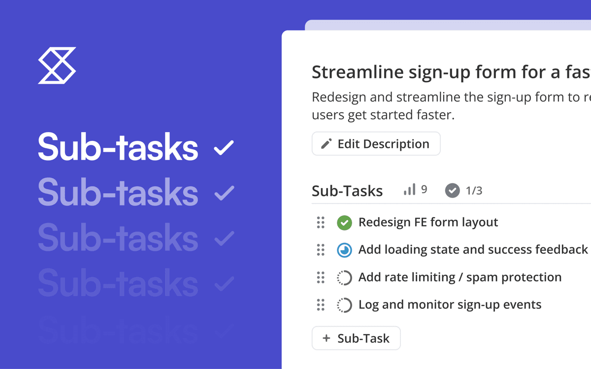
Shortcut's newest reporting tool is our Iteration Velocity Chart. This chart enables you to track and understand your team's historical average output across Iterations and Sprints, helping you better estimate team capacity. You can also slice and dice this data by Story Type, because you may not want to track your Bug work on the same level as your Feature. But, then again, you might want that which is why we show all Story types together by default.
The chart shows how much work was completed in each past Iteration as well as the running average across multiple or all Iterations. These insights provide you with better information when making, as well as the ability to see the impact of changes on shipping velocity as your team grows and takes on new initiatives.
How to get the Iteration Velocity Chart
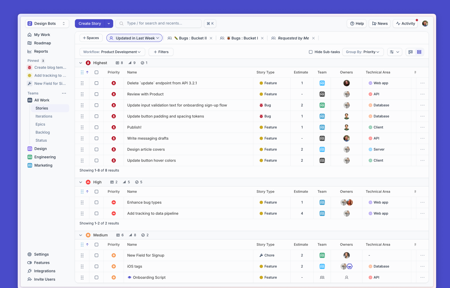
Find the Iteration Velocity Chart wherever the not-Iteration Velocity chart appears (Reports, Epics, Milestones, and Projects pages).
The usual Velocity chart sees the Iteration as a period of time, so you can select it Iteration from the Group by drop-down seen below:

Note: The Group by functionality is now available on Epics, Milestones, and Projects Velocity Charts. The screenshot above is an example of how this looks on the Reports page.
How to read an Iteration Velocity Chart
The Velocity Chart measures work completed for each Iteration.

The x-axis (that's the horizontal one) represents time; the intervals can be changed by using the Group By filter at the top... you may remember it as the filter we saw earlier on this page.
The y-axis (the vertical one) can represent either points or Story count, and you can switch between those options with the "Sum using" drop-down.
Bars are color coded to represent different story types: Feature Stories (green), Bug Stories (red), and Chore Stories (blue). Filter by Story type to zoom into your trailing average by type of Story.

Hovering your mouse over a single bar will pop up a popup with a quantitative breakdown of the Story types, as well as the total number of Stories or Story Points completed within the Iteration or interval.
The dotted grey line shows you the overall average of velocity. This is the total number of points or Stories across the entire date range, divided by the total number of intervals in the chart.
The solid green line shows you a four Iteration trailing average.
Use the Iteration Velocity Chart for powerful insights
The Iteration Velocity Chart can help you team surface the following insights:
- Visualize how much work has been delivered and the team's average Iteration velocity
- Use the trailing average velocity line to understand how many points/stories your team can likely complete in the next Iteration based on your velocity the last few Iterations
- View how your average Iteration velocity changed over time - especially when you're making changes to process or planning, what is the impact of the change on your team's average Iteration velocity
Unfamiliar with our Iterations feature? Learn more about how to use Iterations for Sprint planning via this blog post, this video, or this webinar.
If you have any questions about this update, be sure to check out our Help Center article about the Reports Page, or reach out to our support team at support@clubhouse.io with any questions or feedback.

%20(788%20x%20492%20px)%20(1).png)
.png)