Overview
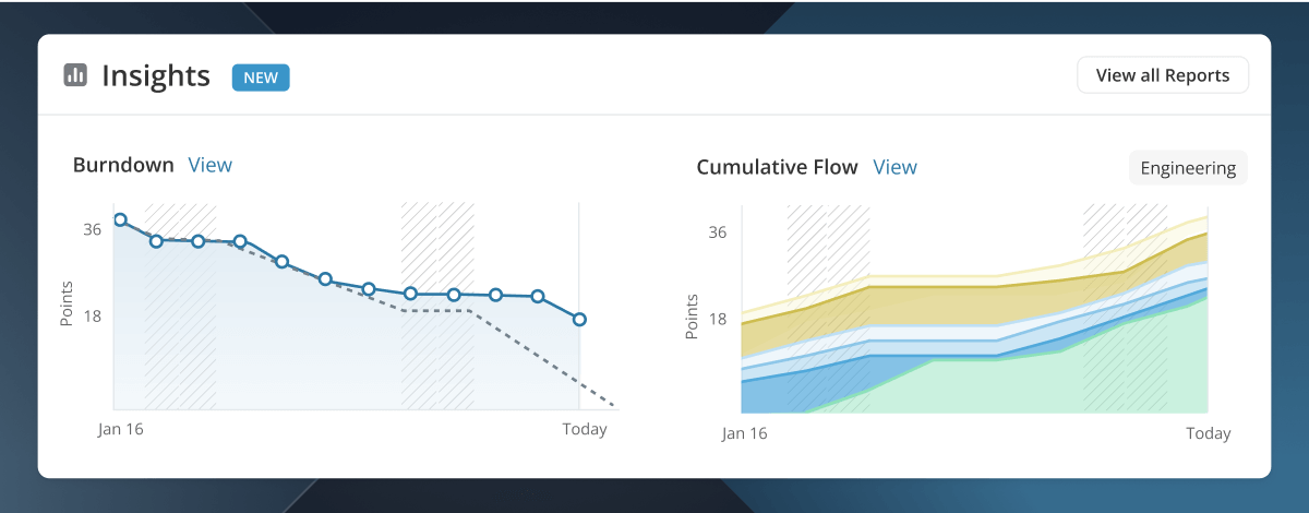
Hit your Iteration goals with at-a-glance versions of your Burndown and Cumulative Flow reports to quickly understand how work is progressing, identify bottlenecks in the process, and if you’ll meet your commitments.
Use these insights to:
- View Iteration Progress: The Burndown chart shows work remaining vs. an ideal pace to finish work on time. This is a quick gauge of iteration status and health.
- Monitor Flow: The Cumulative Flow Diagram shows work progressing through workflow states. It’s useful for identifying bottlenecks and viewing overall status of work.
Insights are available once the Iteration starts, and are locked in for retrospective after the Iteration ends.
Burndown Chart
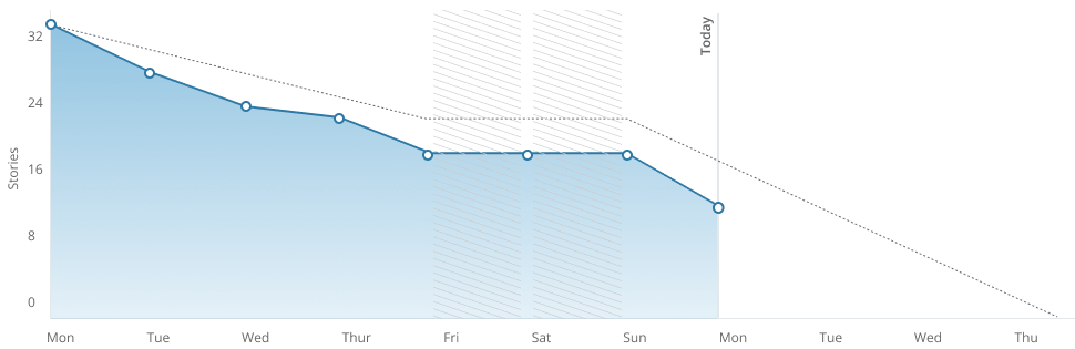
The Iteration Burndown Chart is a graphical representation and projection of remaining unfinished work in that Iteration. In an Iteration, the Burndown Chart is located in the Reports tab of the Iteration Detail Page.
The start date and end date of the Iteration Burndown Chart correlates to the start date and end date of the Iteration.
Understanding the Burndown Chart
The Burndown Report shows unfinished work remaining in an iteration as time progresses. This is the Actual Remaining section of the chart. Remaining work decreases as work is finished or increases if work is added. Remaining work is shown alongside an Ideal Remaining line which charts a constant, “idealized” burndown of work from the start of the iteration until the end.
Deviations from the expected burndown, such as a large difference in Remaining versus Ideal, are an opportunity to drill down to find the root cause and fix it before a sprint or product release is derailed.
Chart Mechanics
Actual Remaining
Actual Remaining is the amount of unfinished work in an iteration. This work can be in any Started or Unstarted workflow state.
The dots represent total remaining work at the end of each day in the iteration. Each data point demonstrates the net change in remaining work from the end of the previous day to the end of the next day.
➡️ For example, if a team completes 5 stories, but also adds 5 stories, the line will remain flat.
Ideal Remaining
Ideal Remaining is a calculated line that progresses linearly from the starting amount of Stories or Points in the iteration down to zero on the last day. This line is not meant to be followed precisely, but acts as a pacing barometer for an iteration. If the ideal line is way above or below remaining work, this is an indication work may be ahead or behind schedule and allows the team to take steps to correct if they desire.
The ideal line flattens across non-working days to indicate work is not expected to progress on these days. Working days can be adjusted in your General Settings.
Ideal Line Starts Today is a toggle in the legend to show the ideal pace to finish starting from the remaining work in the iteration “today”. This setting is useful for teams who add work throughout the iteration, making the first day an inaccurate starting point for the ideal line.
Starting Point
The initial point for both the Actual Remaining and Ideal Remaining lines is finalized at the end of the first day of an iteration. This means your team can add stories throughout the first day, or during an iteration planning meeting, and these will count towards the starting point of the ideal line.
Tooltips
Tooltips show counts of work Added, Completed or Removed each day. This breakdown helps understand the net change for a day. For example, the line might be flat because work was both completed and added.
The “Today” tooltip also shows the status of all remaining work to give a clearer picture of actual progress.
Stories vs. Points
The chart defaults to Stories (total count) or Points, depending on your Estimate Scale settings. There is a toggle to quickly switch between the two on the report.
Non-Working Days
Non-working days are noted on the chart with hatched bars. The ideal line flattens across non-working days to indicate work is not expected to progress on these days. Working days for your Workspace can be adjusted in your General Settings.
Note
An Iteration’s Burndown Chart will “freeze” once its end date has passed. If you are viewing your Iteration Burndown chart in Points, the Burndown Chart will reflect the current Points of the corresponding Stories, up to the last day of the Iteration. That is, if the Points Estimate of a Story in an Iteration changes after the Iteration has ended, it will not be reflected in the Burndown Chart. Similarly, if you are viewing your Iteration Burndown chart in Story Counts, the number of Stories added to or removed from the Iteration after the Iteration has ended, will not be reflected in the Iteration’s Burndown Chart.
Cumulative Flow Diagram
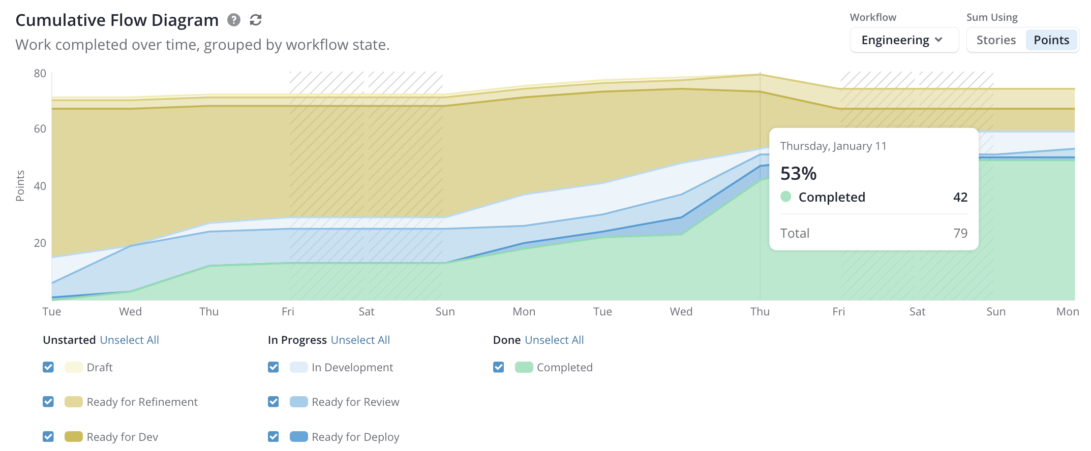
The Cumulative Flow Diagram (CFD) shows the total amount of work in each workflow state over a period of time. The CFD is a powerful tool that can be used to understand a team’s workflow, increases in scope, cycle time, and throughput.
Chart Mechanics
The CFD is organized into three major groups. Each of these are expected to behave differently. It’s important to understand their roles to get the most out of the CFD.
- Yellow Area: Unstarted
- Blue Area: In Progress
- Green Area: Done
Yellow Area
The yellow area represents work in any Unstarted workflow state. This area should shrink over the timeline of an iteration as stories move to In Progress, and then to Done. If this area is not shrinking, it means that work is being added at the same or higher rate as work being completed. Increases in the Unstarted area will lead to an increase in the total chart height. This is a quick way to identify a change in scope.
Blue Area
The blue area represents work in any Started workflow state. This area should maintain a relatively consistent height as work enters and leaves at a steady pace. Increases in height can indicate a team is overloaded or experiencing a bottleneck. Decrease in height may indicate there is not enough work ready for dev.
If your CFD has multiple Started states within the blue area, these can be looked at individually to further understand the stages of development. For example, a “Ready for Review” workflow state that has grown larger than the other Started states may indicate a slow-down at the PR review stage.
Green Area
The green area should always grow as this represents work that is Done. The slope of the line conveys how fast or slow work is entering a Done state. A vertical line would represent a cycle time of zero, whereas a flat line would mean no work is being completed. Changes in slope may indicate work is slowing or that a bottleneck occurred and a lot of work was delivered at once. Ideally the slope of the Done area should be consistent, indicating a steady delivery rate.
Gray Area
Depending how a team manages work, stories in the Backlog may end up in an iteration. Ideally these are moved to an Unstarted workflow state prior to the iteration to indicate they are ready. If present, the Gray Area should be slim and quickly shrink as stories move to Unstarted or Started workflow states.
Measure Cycle Time and Velocity
Average Cycle Time can be measured by drawing a straight line from anywhere on the top of the In Progress (blue) area to where it meets the Done (green) area. The length of this line represents the average time it takes a story to move from In Progress to Done. In the above chart, it’s about 2.5 days (Tuesday + Wednesday + Half of Thursday = 2.5 days).
Average Velocity can be determined by drawing a diagonal between the dotted In Progress line and the Cycle Time line. The slope of the line shows the pace of work, and can be used to calculate velocity. In the chart above, the Cycle Time is 2.5 days, and the number of stories completed is 8, which equals a velocity of 3.2 stories per day (8 stories ÷ 2.5 days = 3.2 stories/day).
Cycle Time Chart
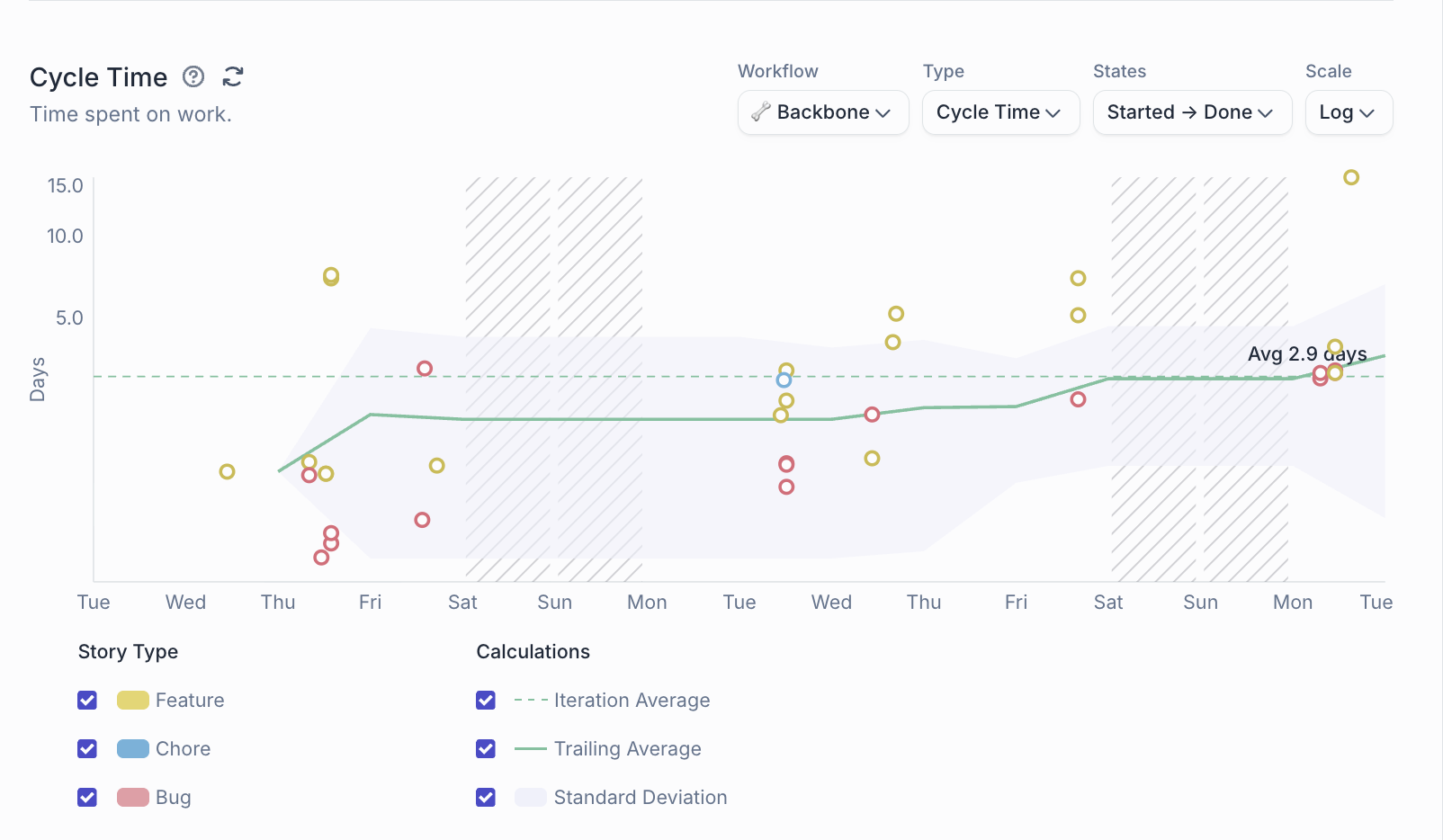
The Cycle Time report shows how long it takes to complete stories. This provides a foundation for understanding and improving team processes and delivery.
The more defined your process is for moving Stories to completed, the more accurate your data will be. For cycle time, it’s important to only move work to in-progress when it’s actually ready (and move it back to unstarted if needed).
Cycle Time Use Cases
Cycle Time measures how long it takes for a story to go from any Started state to any Done state.
A Story is considered started when it is first moved into a started workflow state. A Story is considered complete when it is last moved into any Done workflow state.
Work completion predictions: Cycle times allow you to look at similar projects and provide data-driven predictions on the time it will take to complete them. Lower cycle times mean you can better predict what work you can achieve. Basically, the less time it takes to do work, the better accuracy you have in that prediction.
Unstable cycle times: Chaotic or unstable cycle times can mean that team processes are not well established. This creates a good opportunity for discussion. On the other side, a stable cycle time indicates a team is working at a consistent pace, and not encountering too many disruptions.
Lead Time Use Cases
Lead Time measures the time between when a story is created and when it is completed.
Lead Time is particularly useful in bug tracking, showing how long it takes to complete bugs after they have been reported. Reducing this time means reducing the time that users are exposed to bugs.
Chart Mechanics
Note: Each tick on the x-axis represents the beginning of a day, rather than the end of a day as in Burndown and CFD. Data is not aggregated in the Cycle Time chart — this helps with viewability of the data as well as in identifying patterns.
Time Scale
The chart defaults to a logarithmic scale, which is a method for graphing and analyzing a large range of values in a compact form. This is useful for viewing cycle time data when there are outliers. For an accurate sense of scale, the linear charting method may be chosen.
Trailing Average
The Trailing Average calculation begins after the first story is completed, and accumulates for up to 7 days.